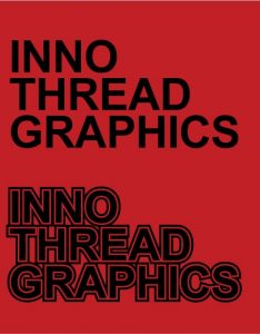
Screen printing still uses individual screens for each color in the printed artwork and because of this it can drastically effect the pricing when it comes to printing smaller quantities. The ‘good ol’ one color artwork has always been a staple in our industry due to it’s cost effectiveness. Here’s a very simple image that shows the use of negative space to bring out the shirt color into the design.
Next time your designing your artwork think about how you can include some negative space in the design to make it really pop!

0 Comments Leave a comment
Comments are closed.